The supplier support hub provides a centralized location for all documents that assist suppliers while working with The Home Depot. The hub additionally provides a streamlined ticketing system that enables suppliers to contact an agent when a document is unable to resolve their problem.
My Role
When I came onto the team, a group of eight engineers had been working on maintaining the legacy system for a couple months. I joined the team with a new product manager, Kim Houston, and we undertook a full team Discovery and Framing to understand the space.
Kim and I created a set of scripts for both our stakeholders and suppliers. As we conducted interviews, our engineers sat in a separate room, listening in and taking notes on the conversations. After each interview, we synthesized our findings as a team and discussed what we learned.
Cluster Analysis
As previously stated, after each interview we would synthesize our insights as a team. The following images contain the insights we heard from each interviewee.


Insights
Our research found that suppliers' main complaints were about the amount of time required to resolve an issue. We heard many stories about how difficulties with one of our applications would lead to a week long delay in a team's work process. Inability to find the correct data also caused a great deal of additional issues, requiring suppliers to reach out to The Home Depot.
When they did reach out, suppliers felt they were not matched with the correct agent initially, then were bounced around, delaying the time it took to resolve the issue. This added time to the team's overall work process and gave suppliers very little insight into how the issue was actually resolved.
During our interviews, suppliers had many ideas regarding how issues could better be resolved. Some included AI chatbots, better self help articles, visibility into what articles worked for others in similar roles and logs of how agents resolved their issues.
Design Studio
as a balanced IT team
Once we completed the interviews, my Product Manager and I led our team of engineers through a design studio to get some of their ideas on paper.
The design studio consisted of two rounds. In the first, ten minutes were spent sketching out initial ideas. We then took about a minute each to share our thoughts. After hearing every idea, we went into the second round of sketching, generating the new ideas that may have sparked from our presentations. After the second round, we once again shared our thoughts and dot voted on the ideas we liked.
After the design studio, the Product Manager and I went through each idea to select which were realistic for our scope and which were more idealistic.


Realistic Ideas
- If the user is using an application that currently has the ability to route them to the legacy ticketing system, we instead route directly to a page containing articles for that application, along with the improved ticketing system.
- If the user is on the website containing all the applications an external individual would use to work with The Home Depot, they would have access to submit general support tickets from there.
- Autosuggest when the user is searching for a question.
- Customizable content based on user type and apps used.
- Use the steps to solve previous tickets inform self-solve articles.
- Top Issues per application.
- Autosuggest resolution steps from within a chat box.
- Trending discussions and trending articles.
- Open issues: items The Home Depot needs the vendor to complete to resolve an issue.
- Search: displaying top three search results and search result ranking.
Idealistic Ideas
- Ability to search through a transcript associated with a video.
- Ability to watch a transcript highlight text as the video progresses.
- AI chatbot
Design Studio
with our stakeholders
In addition to conducting a design studio as a team, we conducted one with our stakeholders allowing us to achieve two main goals:
1) Gain an idea of delivery expectations.
2) Introduce UCD practices to a group of people still considered new to a user-centered, balanced team methodology.
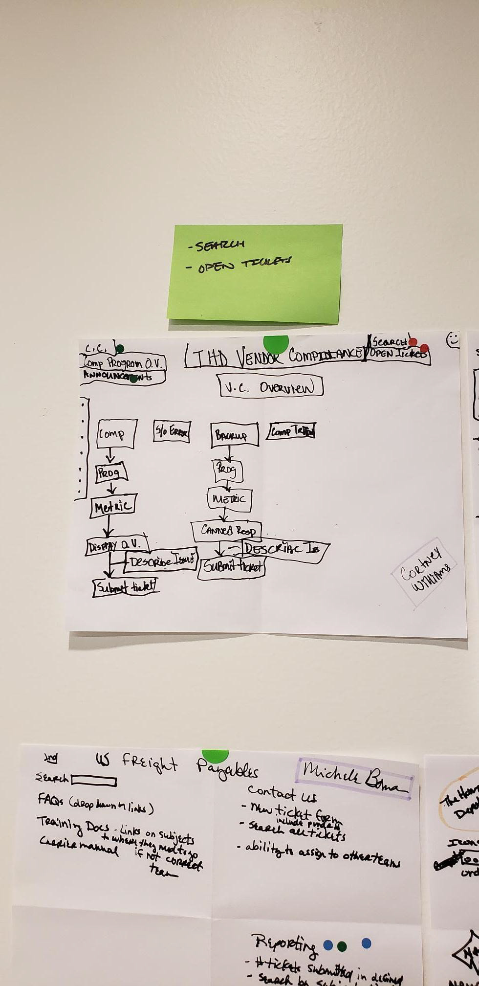
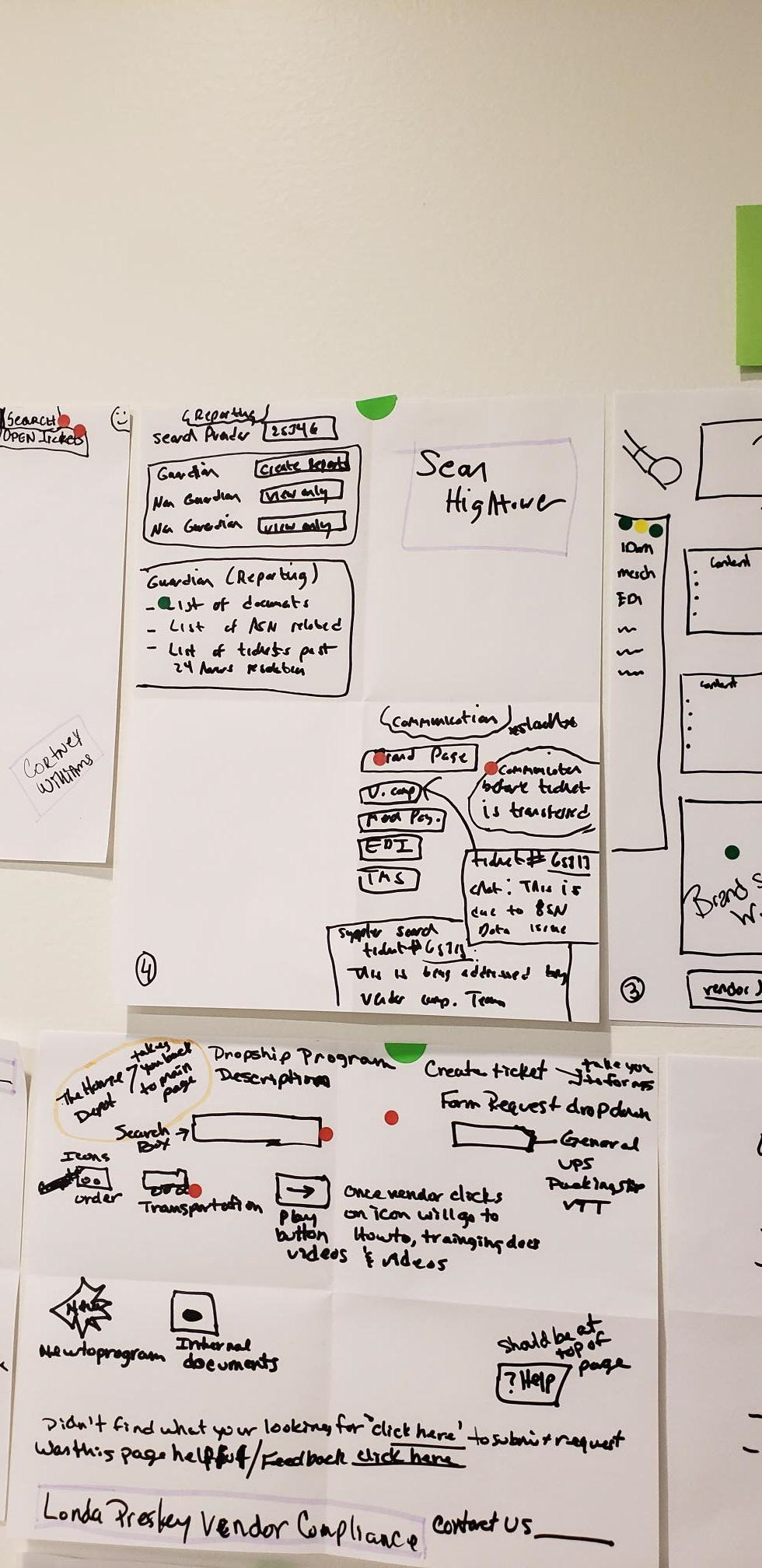
Creating a Process Flow
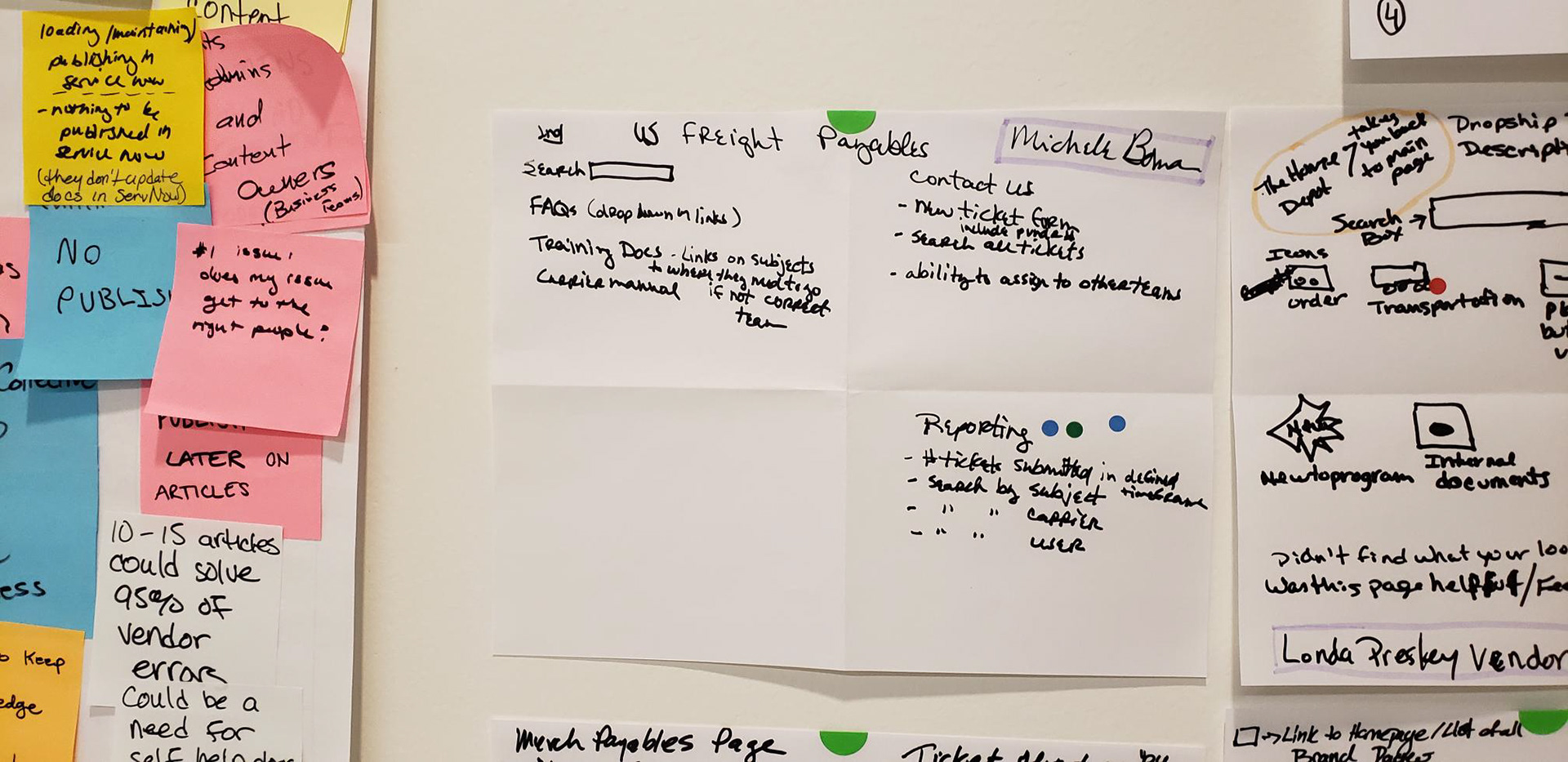
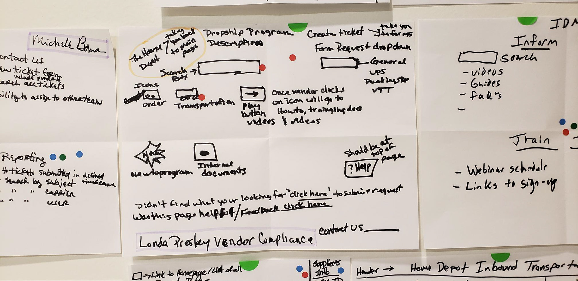
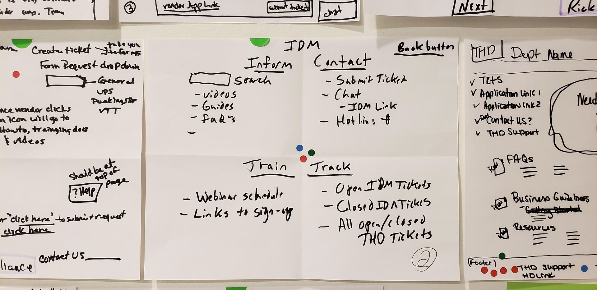
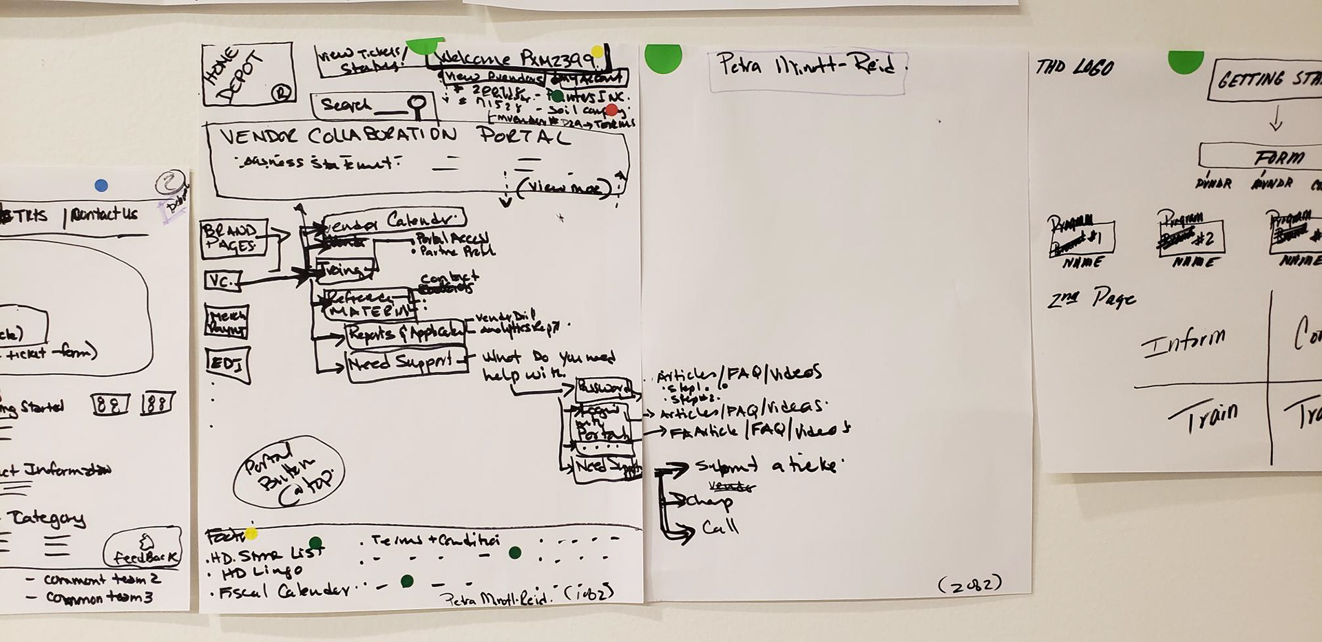
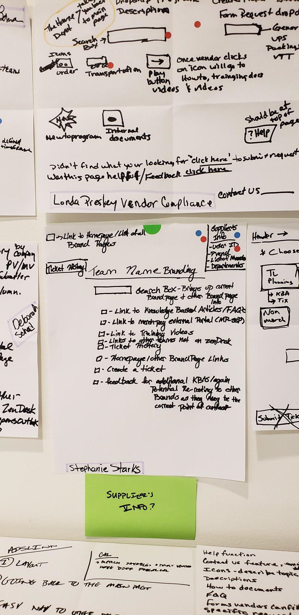
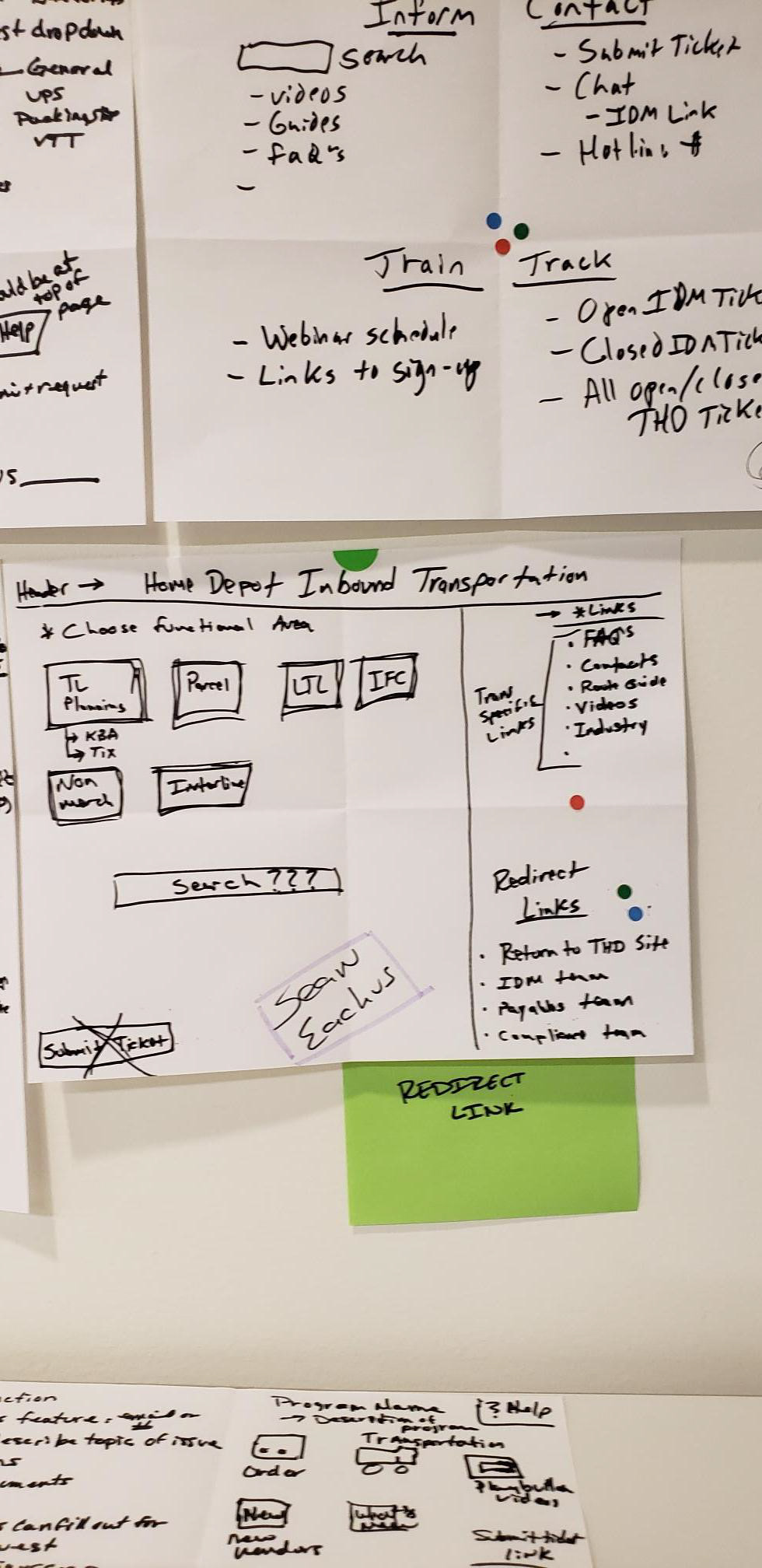
After completing the design studio with our IT team and stakeholders, I then reviewed each idea and created a process map that best encompassed what most people had alluded to. I then categorized features requested by our stakeholders on green sticky notes, and features our balanced team came up with from listening to user interviews on blue sticky notes.
To ensure that we included what our business viewed as necessary, and what our users felt they needed, I then placed each sticky where it would reside within the website. Ideas that are viewed as idealistic are marked with an orange dot.


Content Categorization
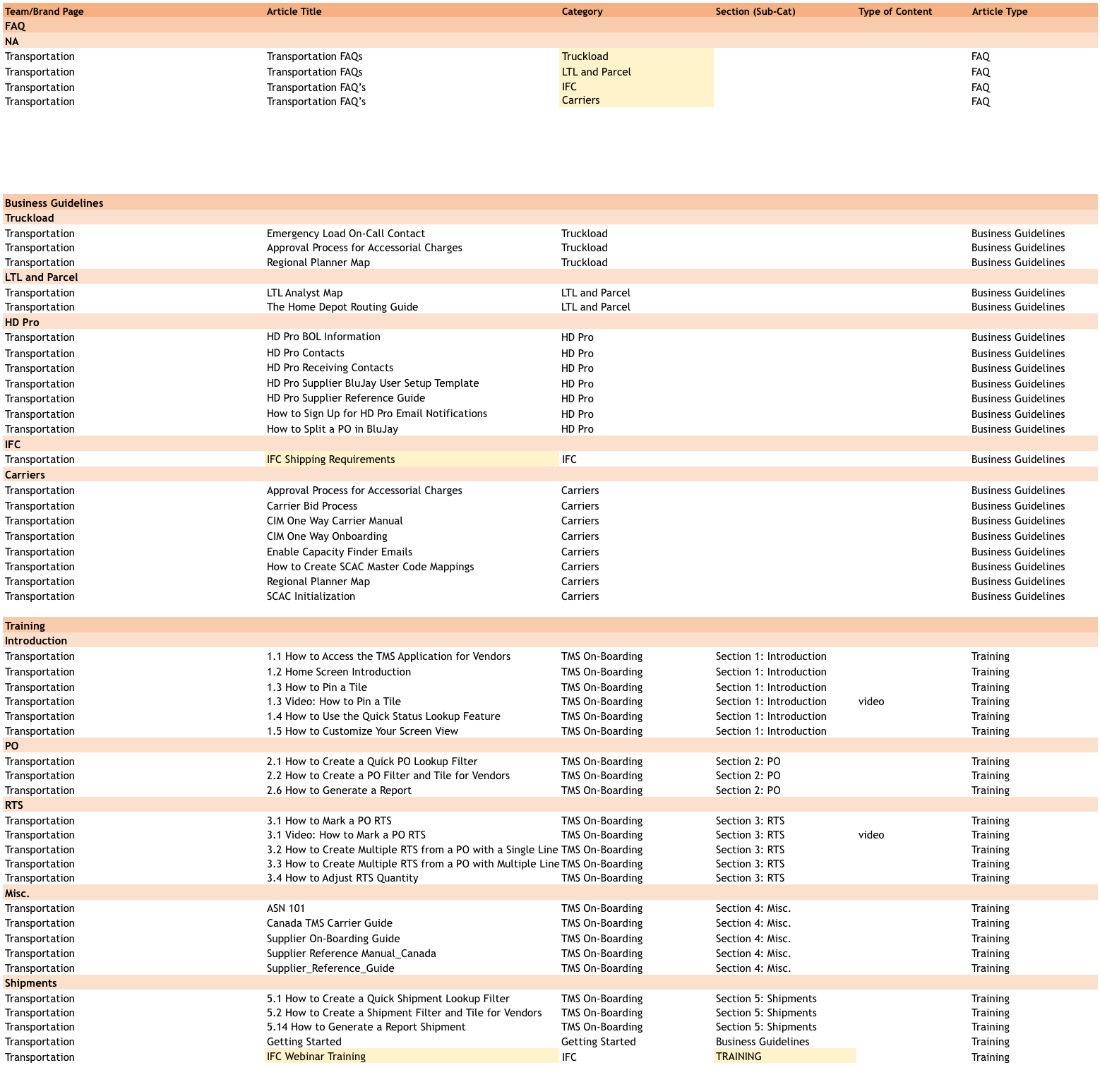
Once we established the overall flow of our product, I created a card sort, through Optimal Sort, that allowed us to define a hierarchy for the current content offered on the legacy site. We additionally had a content team that used their own research methods to better enhance the type of content we would provide suppliers. We met with this team weekly to discuss the findings from our individual research efforts.
While I waited on responses from the card sort, I began prototyping and testing our overall process flow defined above.
Card Sort Results
Dendrogram examples representing how we received the data.
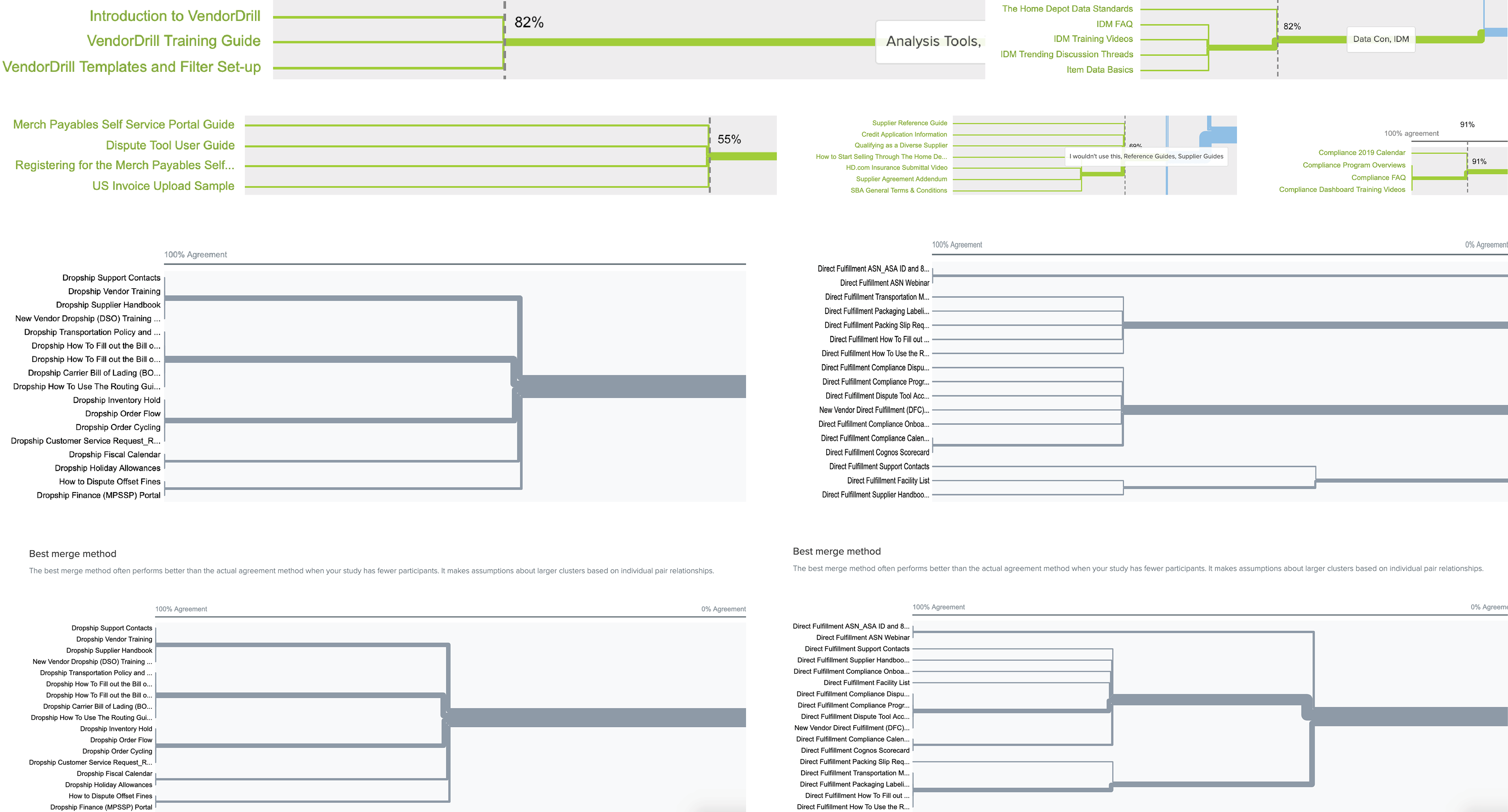
Card Sort Results
Below is an example of my personal synthesis of the card sort.
Items in yellow indicate a variance across users tested.
Initial Design
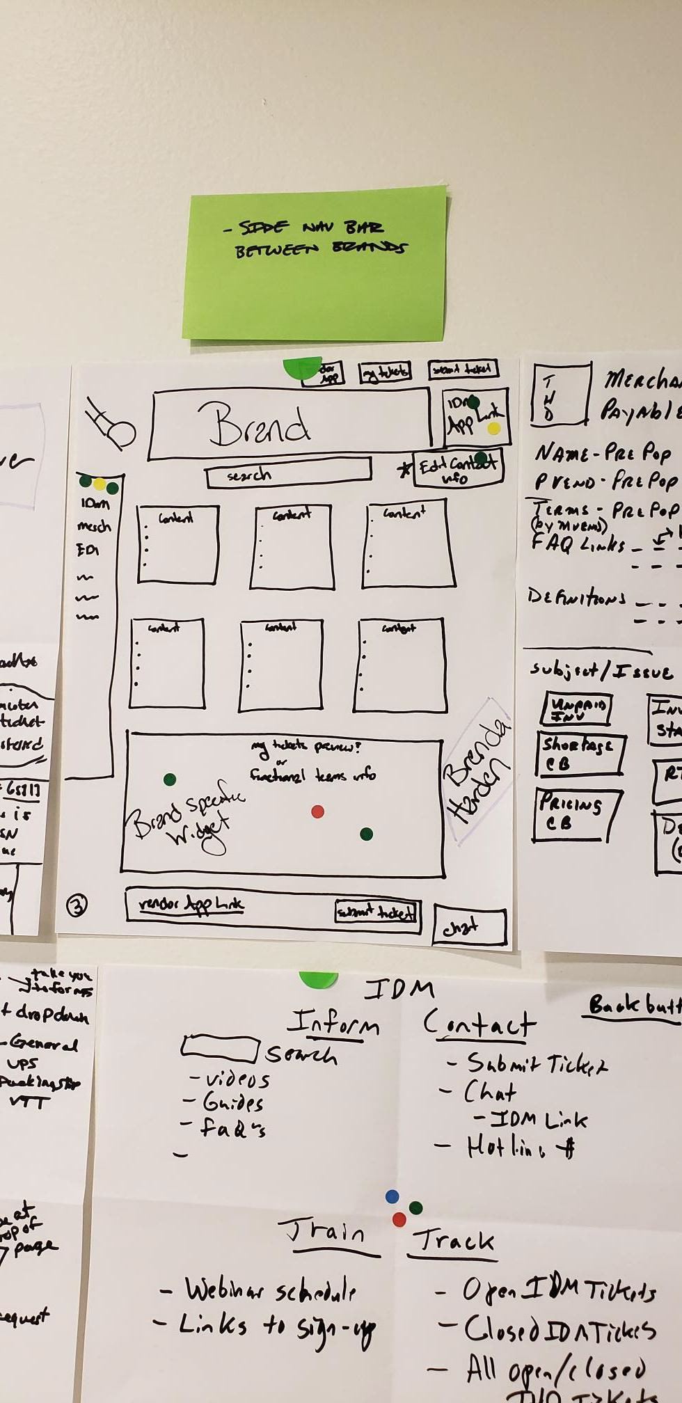
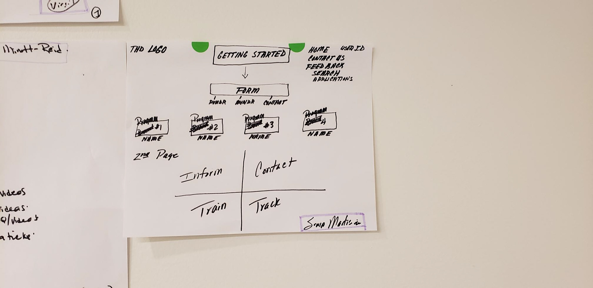
Based on our interviews, design studios and various meetings, I then created our initial prototype for testing.
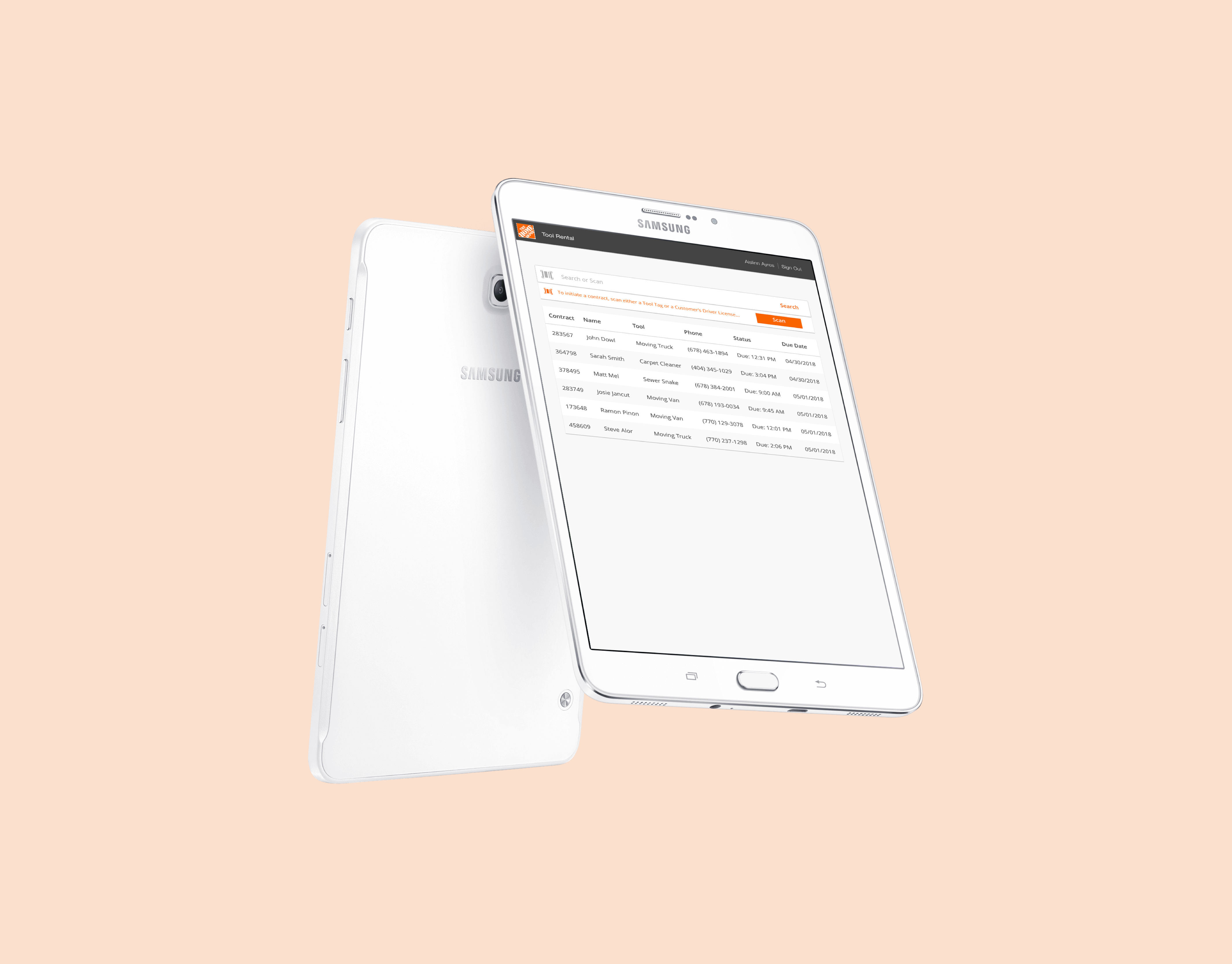
Getting support from the application
During our interviews, we continually heard that suppliers wanted a way to easily access support directly from the application they are experiencing an issue with. Suppliers discussed the benefits of an AI chatbot, which would allow them to gain the benefit of feeling like they are speaking with an agent without having to submit a ticket and wait for a response.
When mapping out our process flow, we decided that a chatbot is still a bit idealistic. We did, however, like the idea of creating a component in each of our applications that would lead users to a support page specific to that application.
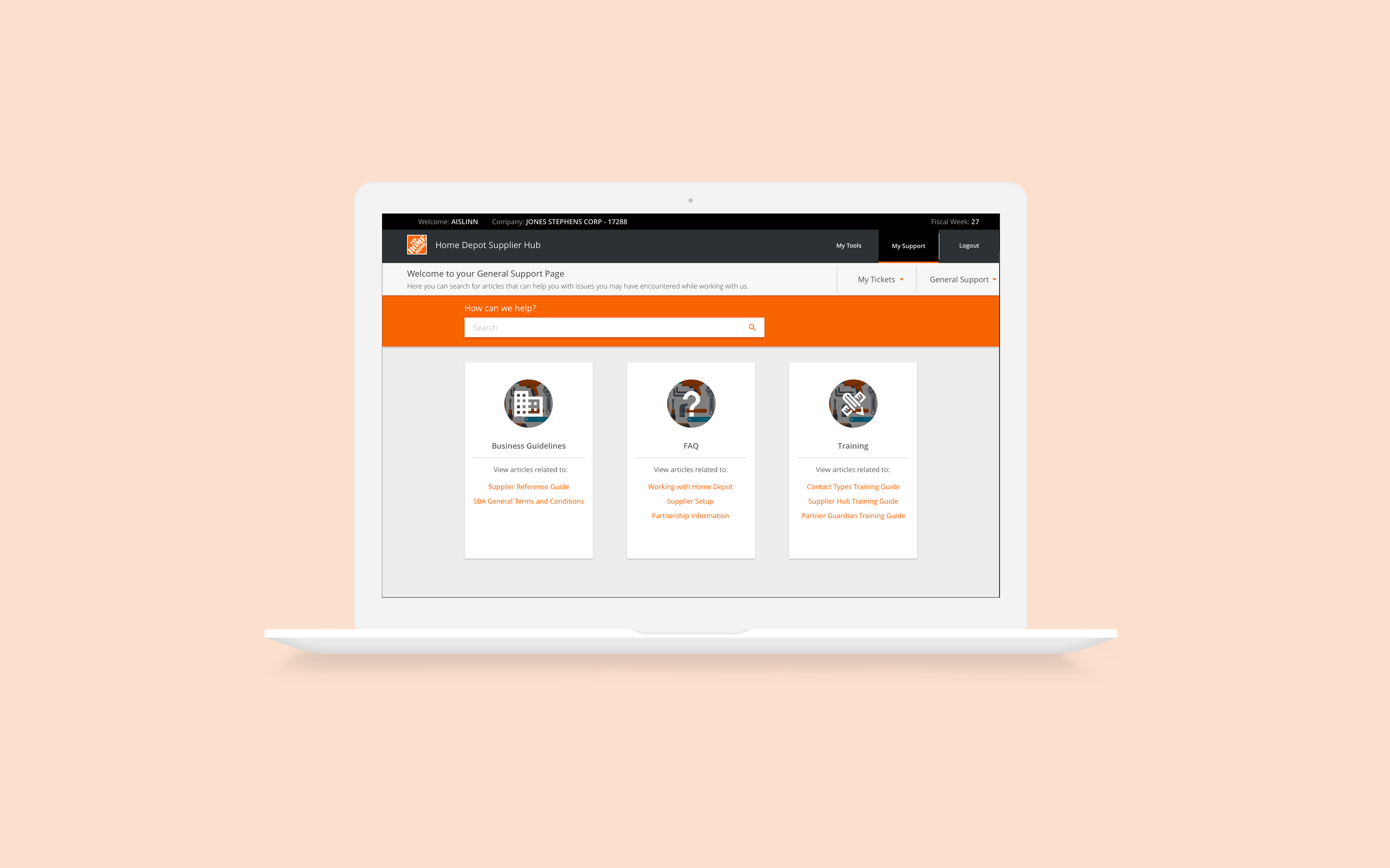
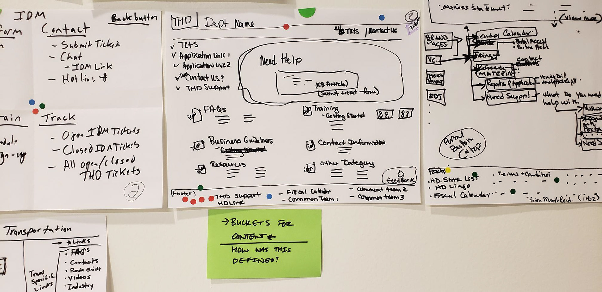
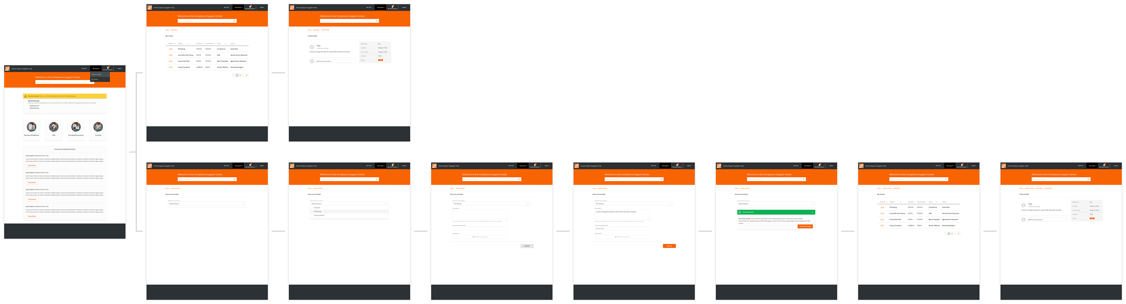
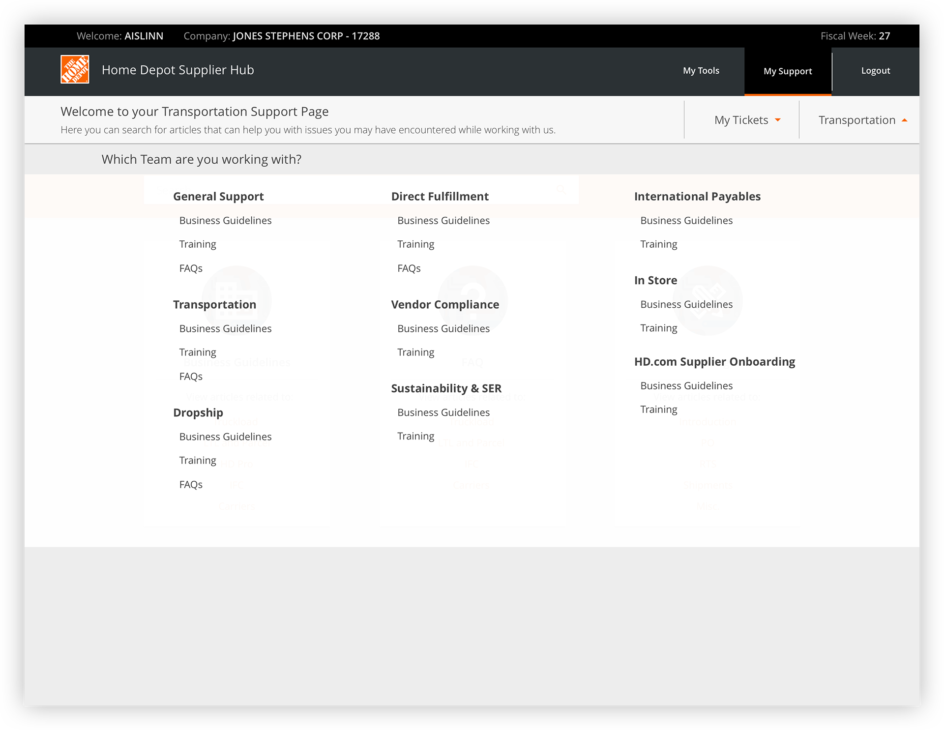
When users arrive to the support page associated with the application they were using, they would see four main buckets, along with an information card containing issues The Home Depot is already aware of and is currently working to resolve.
Below is a visualization of this process.
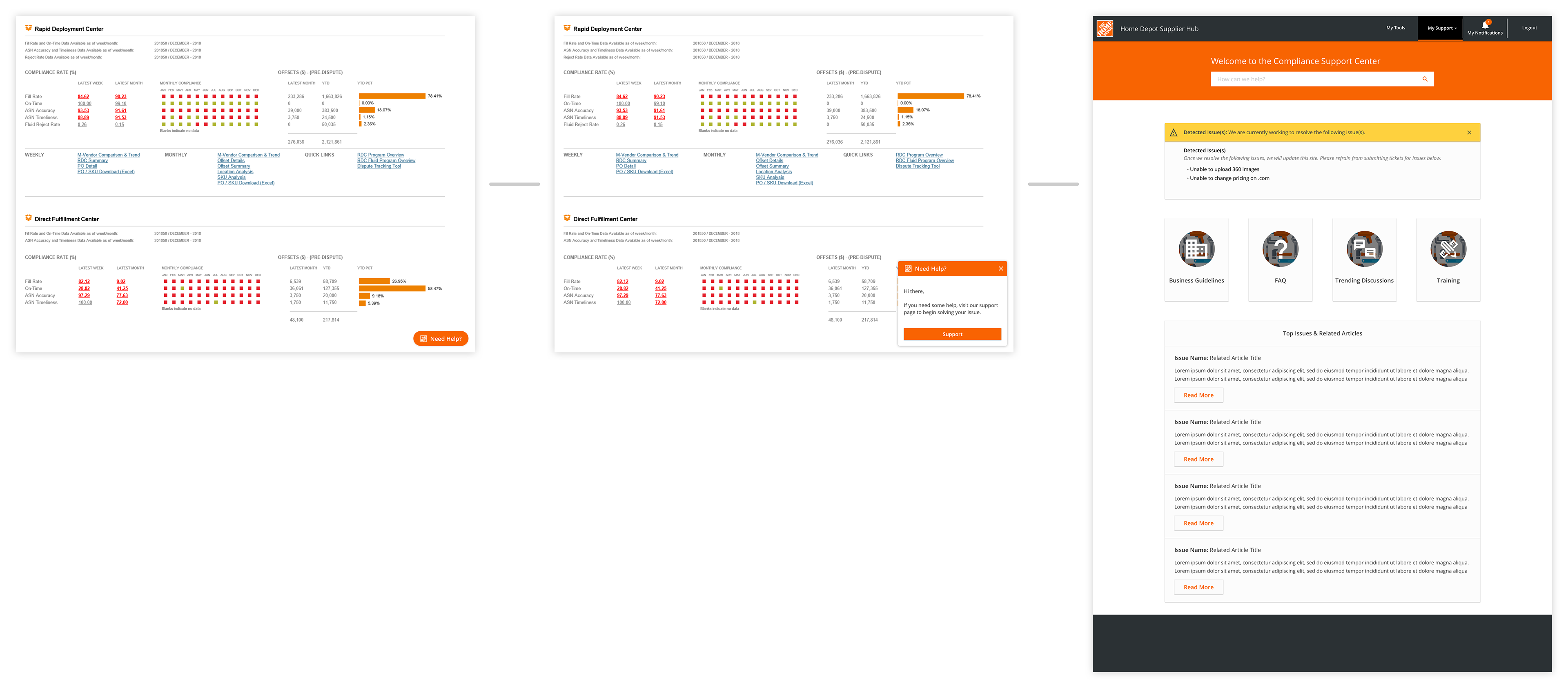
Business Guidelines
During our interviews, we found that suppliers expect content to be split into four main categories: Business Guidelines, FAQs, Trending Discussions and Training. In the business guidelines section, suppliers expect to see all legal documents that are necessary for doing business with The Home Depot. Suppliers felt like they would regularly access these articles for the first few months of working with us. Afterwards, they would reference them on a more monthly basis.
Because suppliers would be more likely to review each document individually, without looking for a specific document, we formatted this page with some summation text of each document's content.

FAQs
Suppliers additionally stated that with the current system it is not always easy to find answers to questions that suppliers feel like should be easily accessible. To alleviate that pain, we created a simple FAQ page and surfaced this finding to our content management team so they can conduct research on what FAQs would best assist suppliers.
Trending Discussions
Suppliers also shared the sentiment that if they are experiencing an issue, other suppliers must also be as well. To solve for this need, we added a Trending Discussions page where suppliers can go to view what sort of issues others are experiencing. When tested, suppliers stated that they would spend the most time on this page for two reasons:
1) To see if other people have experienced issues they are currently or have previously experienced.
2) As a secondary training resource so they are aware of what types of issues they could experience.
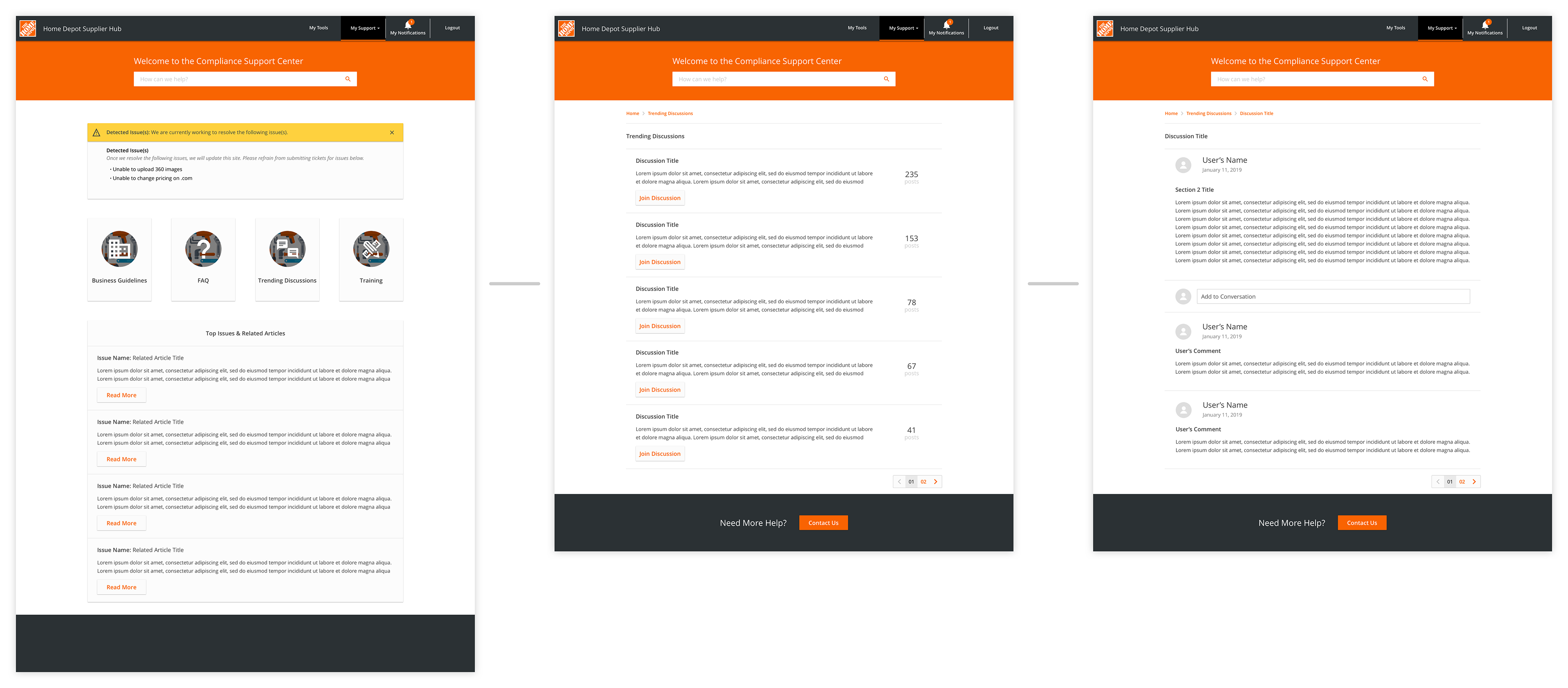
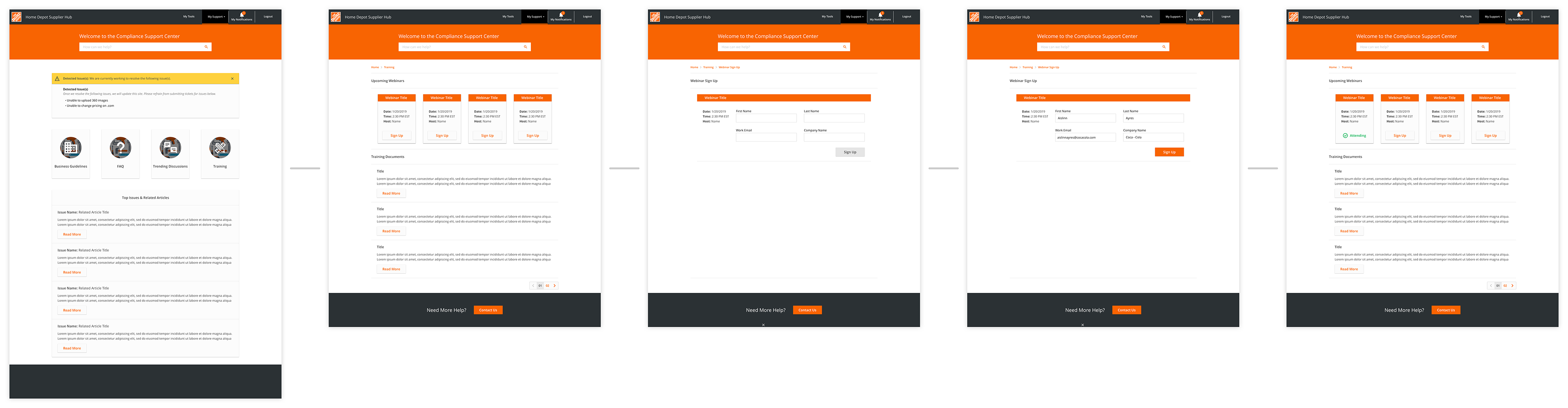
Training
When suppliers think about training, they mainly envision scheduled webinars with supporting documents and transcripts. Because of this, we provided users with the ability to easily sign up for webinars and view associated documents. When tested, we received the feedback that the associated articles should remain on the same page as the webinar sign up.
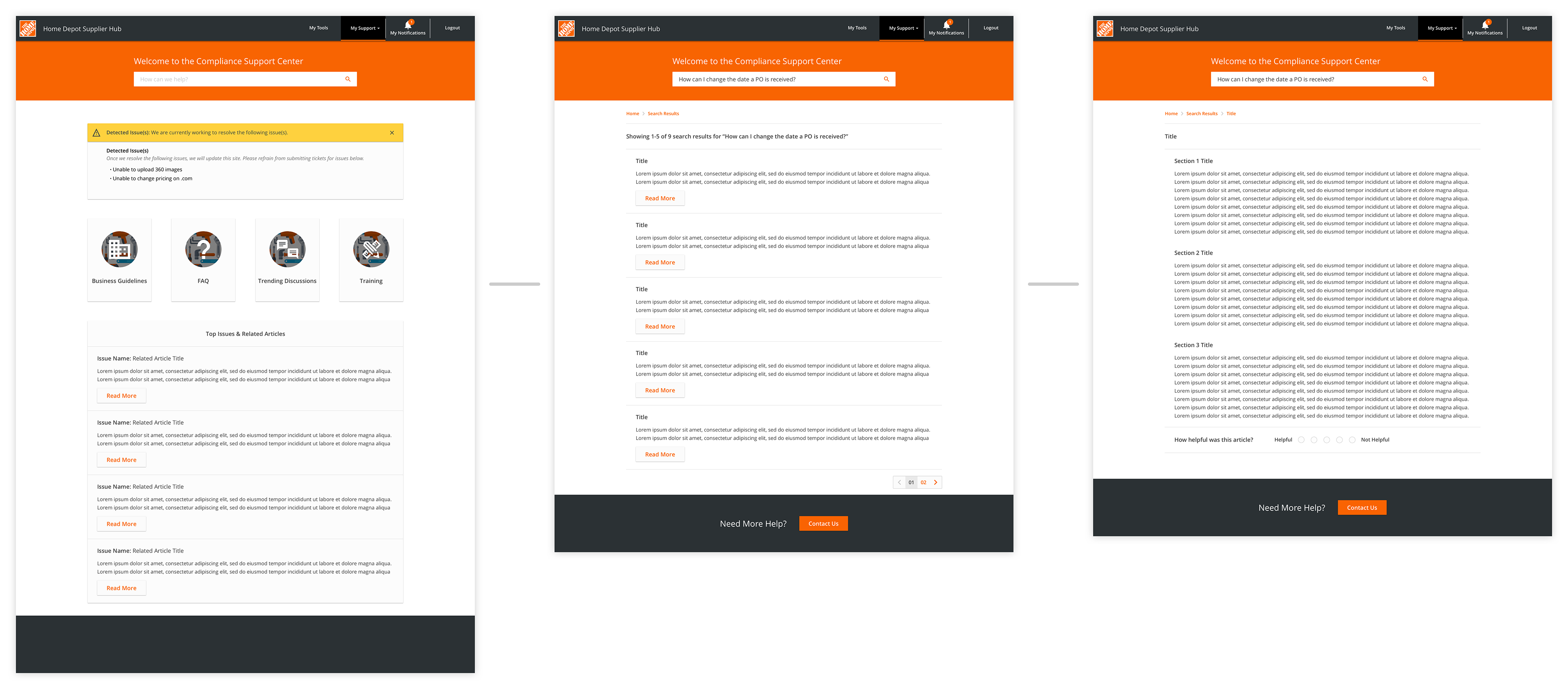
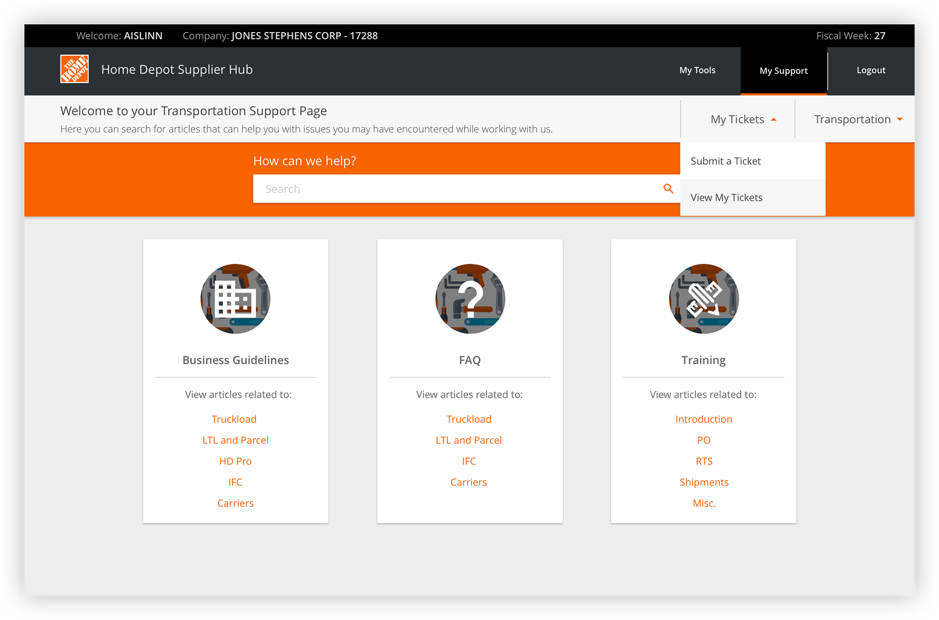
Search Results
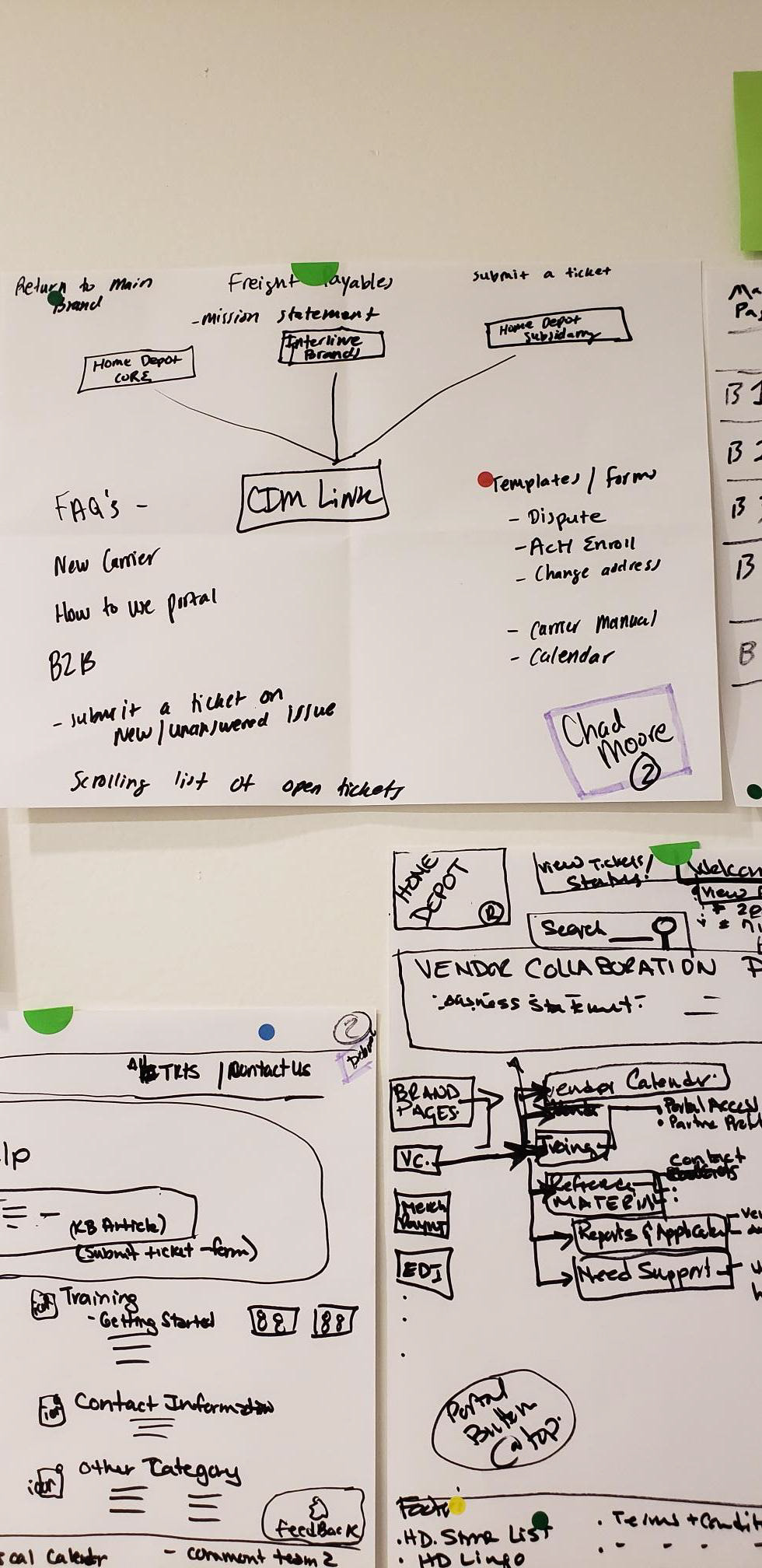
In addition to the content in the four previously defined categories, suppliers will always have the ability to search content over the support site associated with the application they came from. There are multiple support sites for the individual applications' different roles use while working with us. What sites users have access to depends on their credentials.
As previously stated, we conducted a card sort while testing this prototype with users. The card sort served as a foundation for how we would categorize the content. We would additionally develop an AI within the search bar to further categorize the content.
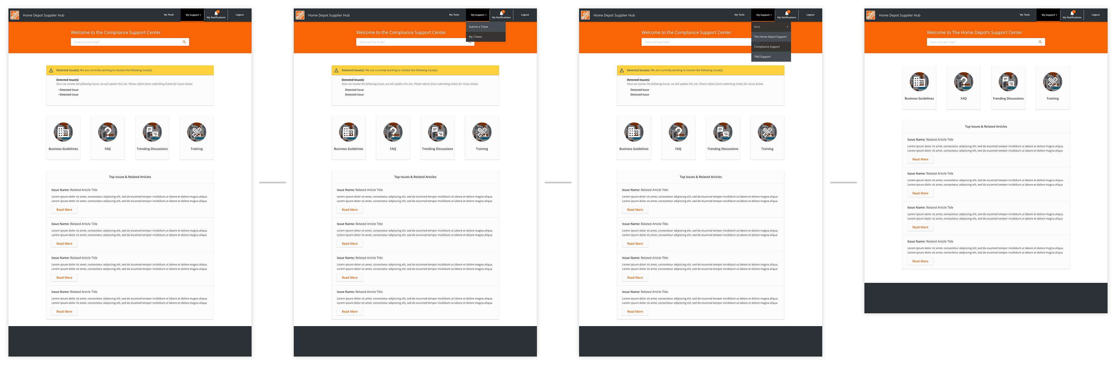
Switching Support Sites
Suppliers can find all of the support sites in the header. In this example, the supplier is going from the Compliance support site to The Home Depot's General support site.
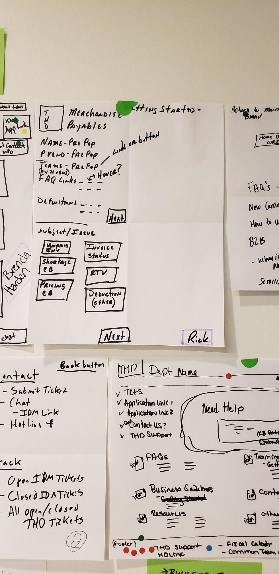
Submitting a Ticket
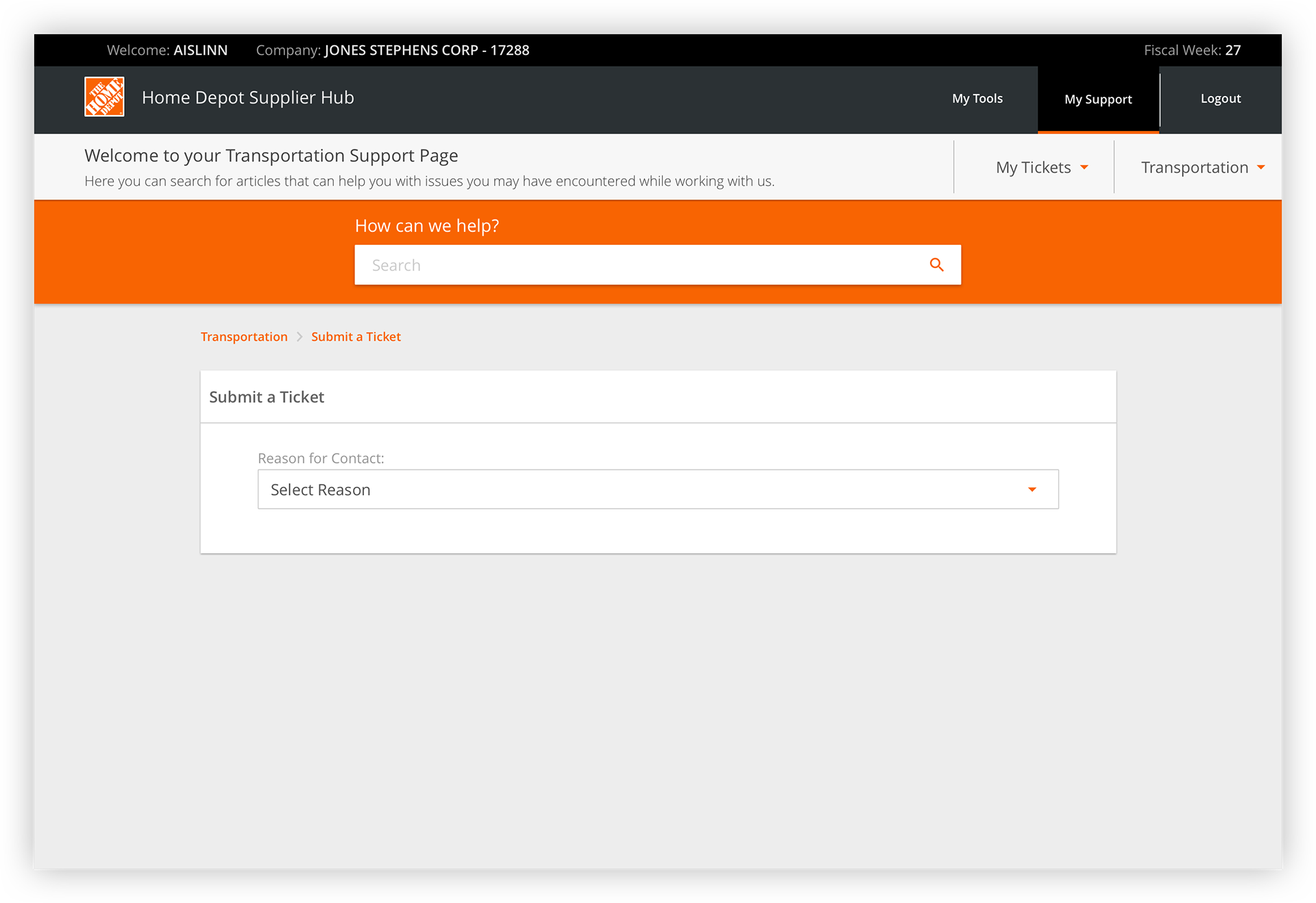
If suppliers are unable to resolve their issues with the provided content, they can submit a ticket to contact a Home Depot agent. Suppliers can submit a ticket either through the menu in the header or at the end of each article. When they select the option to submit a ticket, they will be taken to a page with a list of options curated to the specific applications they use.
The content team working with us conducted research to define which issues to display and which agents to filter each issue to. When we conducted our initial interviews, we consistently heard that when suppliers submit a ticket they get bounced around between agents, delaying the time it takes to resolve the issue. Curating this list helps minimize the number of people they interface with, thus decreasing the time required to resolve the issue.
Suppliers additionally felt they were given very little insight into how a problem is resolved, and felt like if they experience the issue again they wouldn't know how to solve it. To resolve this problem we provided a ticket information page that allows users to see any recent activity taken.
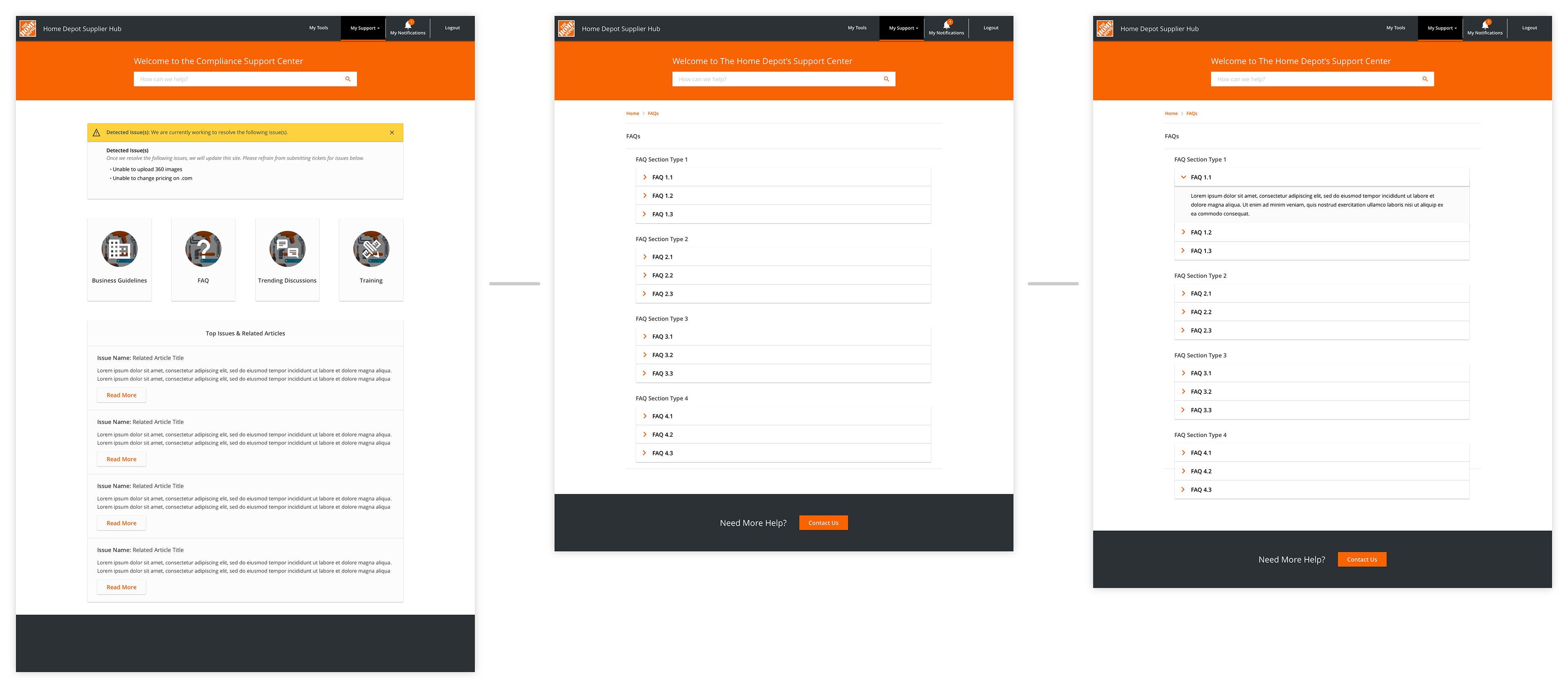
Final Design
Once we tested the prototype displayed above, and synthesized the results from the card sort, we developed with the following screens for our final design. After creating these final designs, I was moved to the Price Maintenance team while this work was integrated into a parallel work-stream.
Home
Although users expressed a desire for a Trending Discussions bucket to see how other suppliers were able to solve issues, we received a great deal of pushback from our business stakeholders. The main concern was that we would not have the resources to monitor and control the pages appropriately. In order to please all parties, an agreement was made to further research suppliers' needs and develop a comprehensive solution.
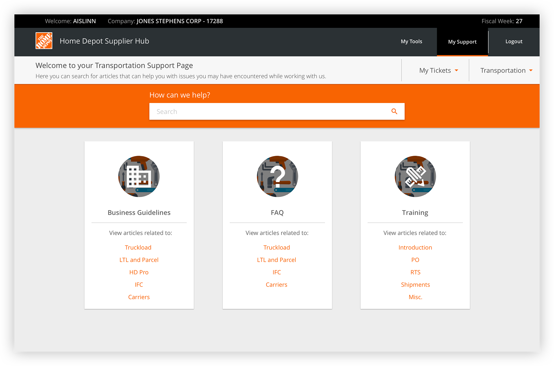
Business Guidelines
When suppliers click into the Business Guidelines, they are able to see the four subcategories for this bucket, similar to the buckets on the home page. Here, suppliers are able to click on each subcategory, and the right side of the screen will anchor to that section of content. From this point, suppliers can view the supportive text and select which article they would like to view.
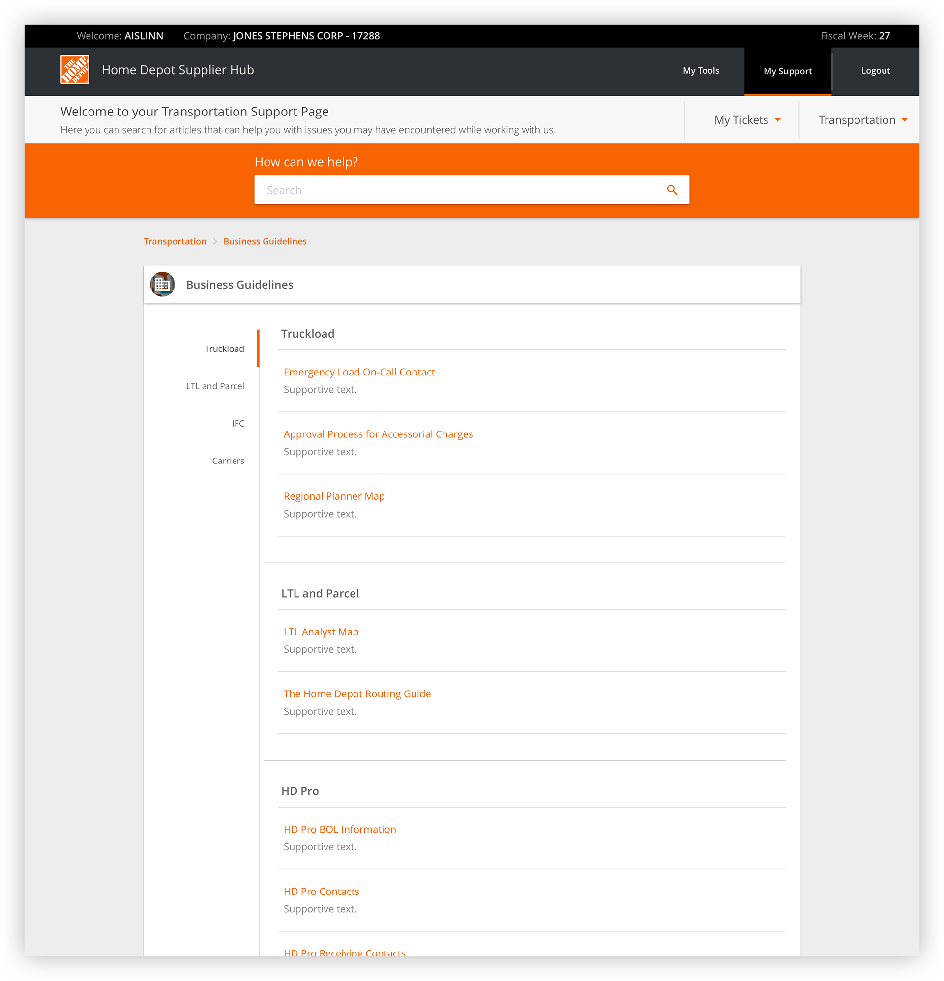
FAQ
Users had very simple requirements for an FAQ page: show me a list of things I should know. As this was essentially the only expectation, and we wanted to have each bucket's page be as consistent as possible, we repeated the same format as the Business Guidelines page. Based on our content team's research, we would have the supportive text display enough information to answer the user's question. If the user needed to know more, they would be able to click into each FAQ to see a more in depth explanation.
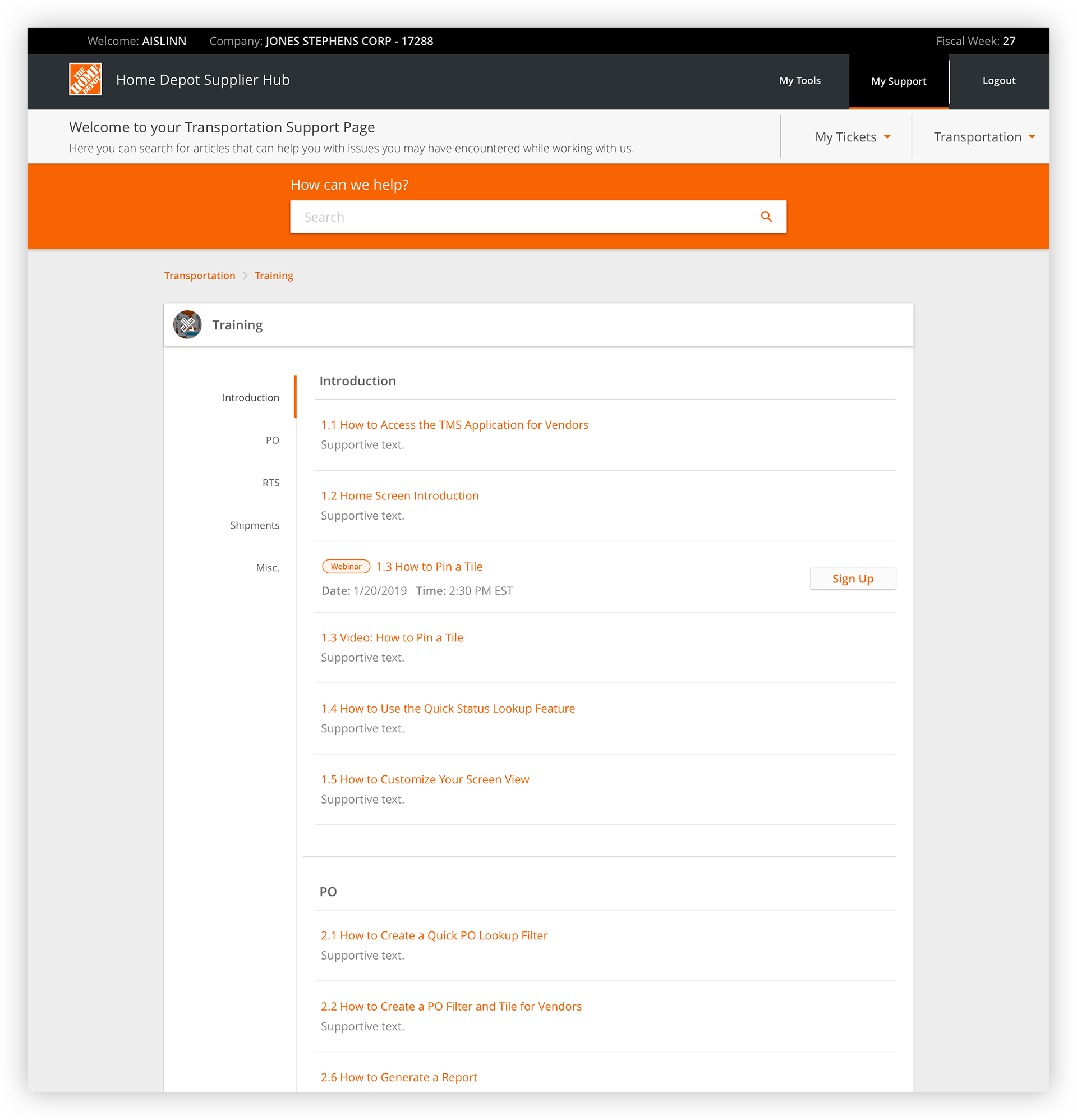
Training
For consistency, the Training bucket would continue to be formatted this way with the exception of displaying if there is a webinar associated with an article. When so, the user would be able to automatically sign up by simply clicking the button.
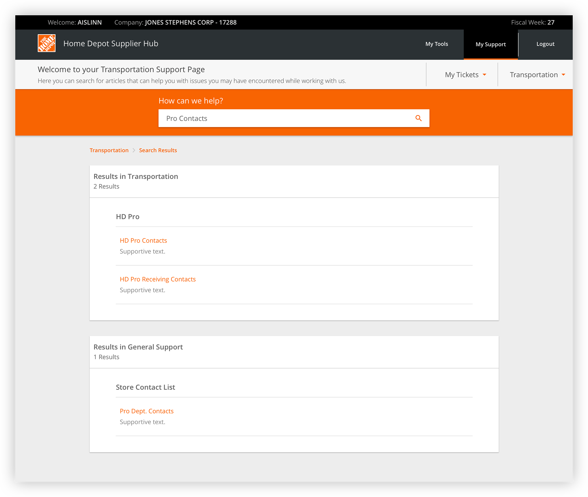
Search
As stated in our initial design, users are given access to different support pages based on the applications they work with. So users do not have to constantly bounce between the support pages, they have the ability to search within one and see relevant results among all the pages they have access to.
In-site Resource
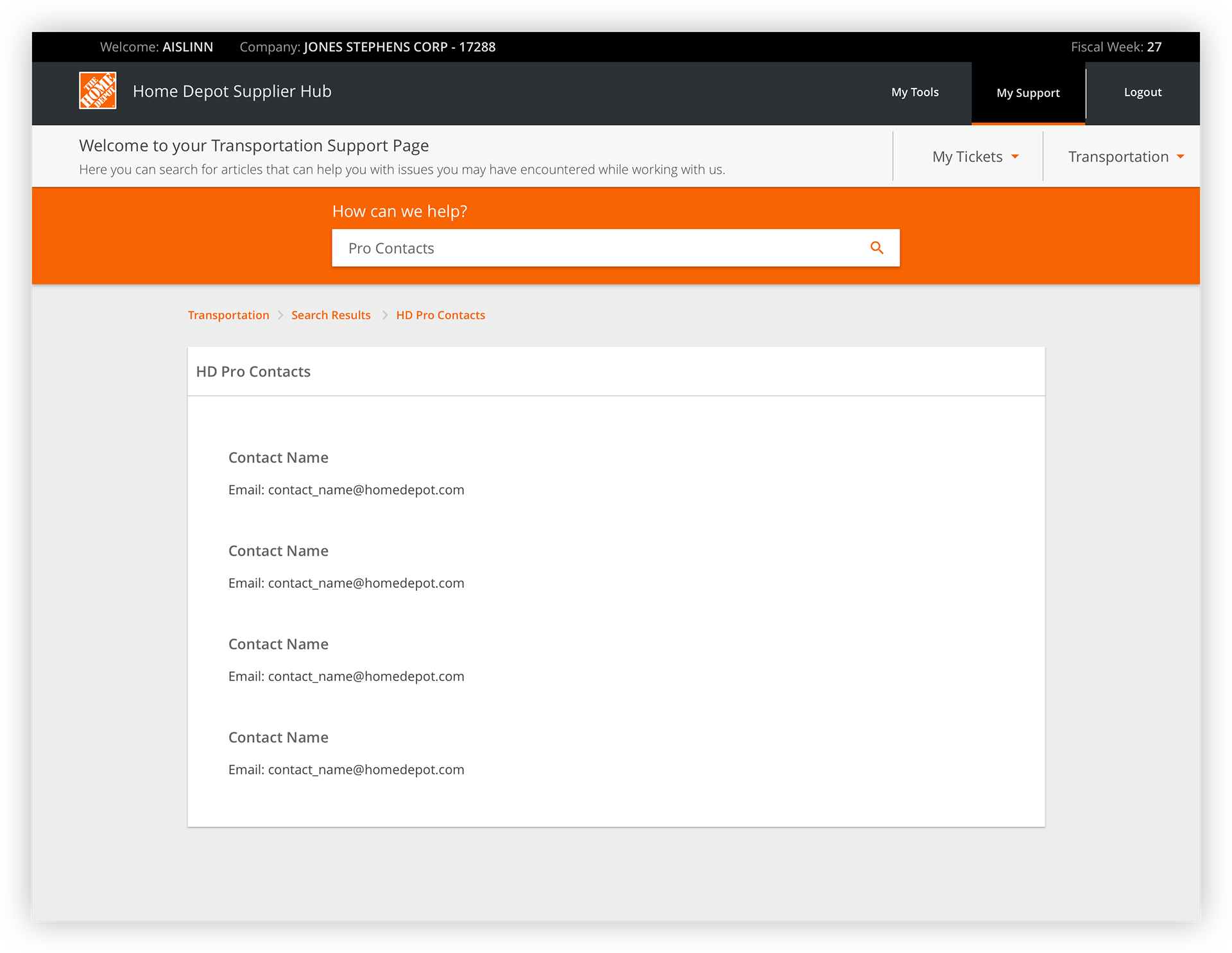
If a user selects a search result within the support site they are on, they are navigated from search results page to the article. To return to the search results, or home page, they are able to use the breadcrumbs.
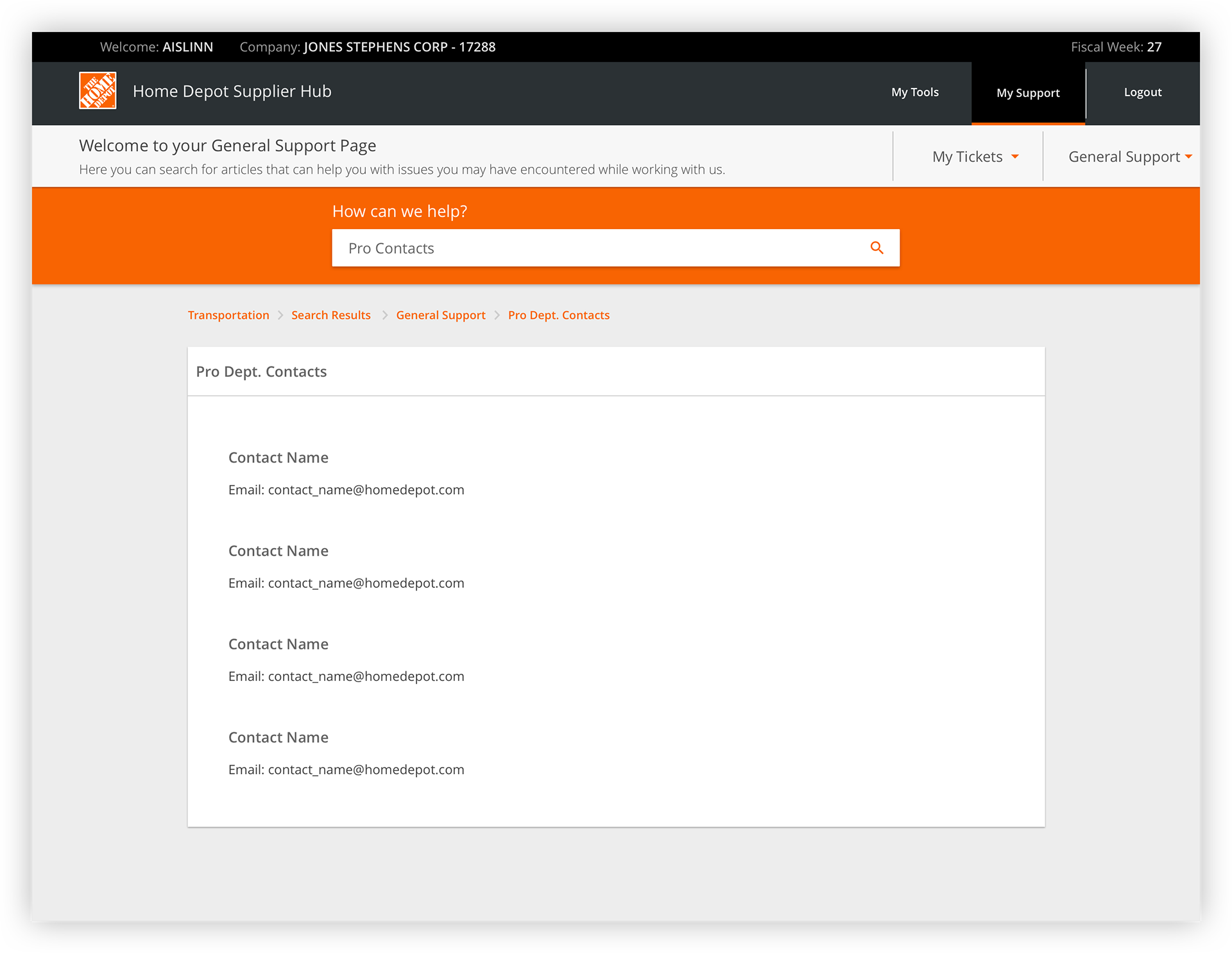
Cross-site Resource
If a user selects a search result from another application's support site, they are directed to the result. The breadcrumbs indicate that the user has gone through another support site; this informs the user that this content is not associated with the site they were initially searching within. While going through this flow, the user would never actually see the home page for the General support site.
The user is then able to use the breadcrumbs to navigate between each support site. At this point in time, the user is in the General support site but can easily return to the Transportation support site.
Cross-site Navigation
Independent of searching, the user is able to use the secondary header to navigate between each site. The user can either click into the individual site's homepage by selecting the overall title, or directly into the buckets contained within each site.
Accessing Tickets
While on a support site, the user can access previously submitted tickets in the secondary header.
Curated Ticketing
As previously stated, our content team did a great deal of research to streamline the ticketing process to ensure the correct issues are accessible to the user and directed to the correct agent.
Submitting a Ticket
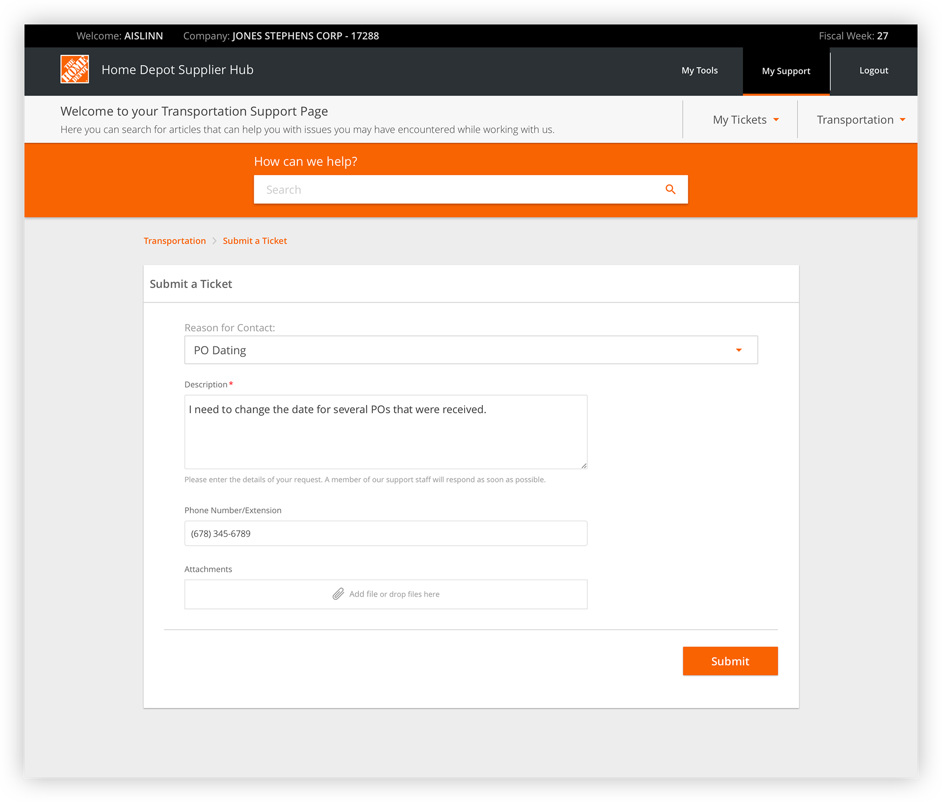
Once the user selects the issue, they are then prompted to enter the necessary information.
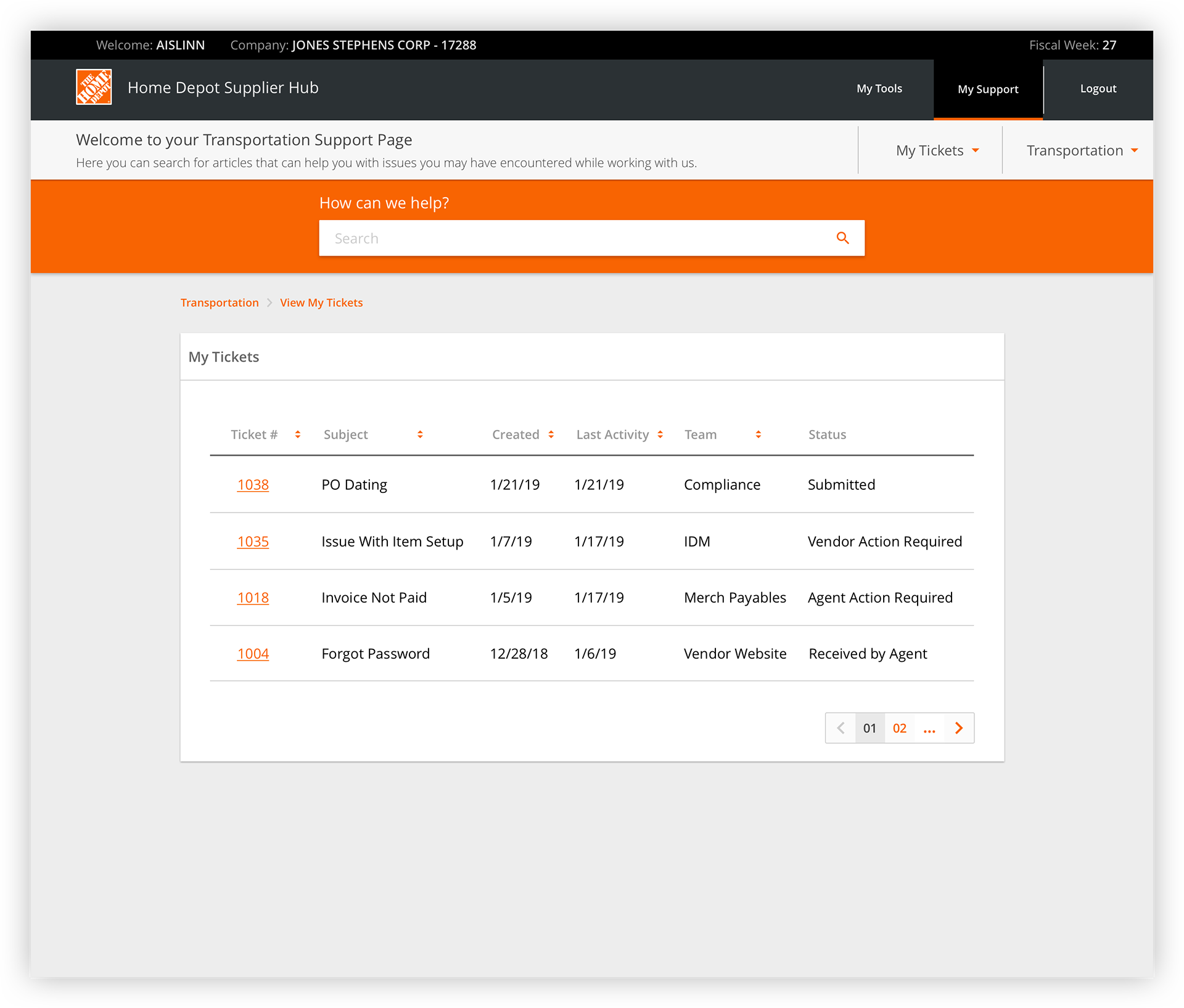
Submitted Tickets
After submitting a ticket, the user is directed to the "My Tickets" page. Here all the tickets they previously submitted are displayed. Based on interviews, users generally said they would expect to see the tickets sorted based on if they need to take action on the item. Users then stated they would expect to see tickets that have recently been submitted first while items that would require their action would be second. Tickets that required an agent to take action would be sorted to the bottom.
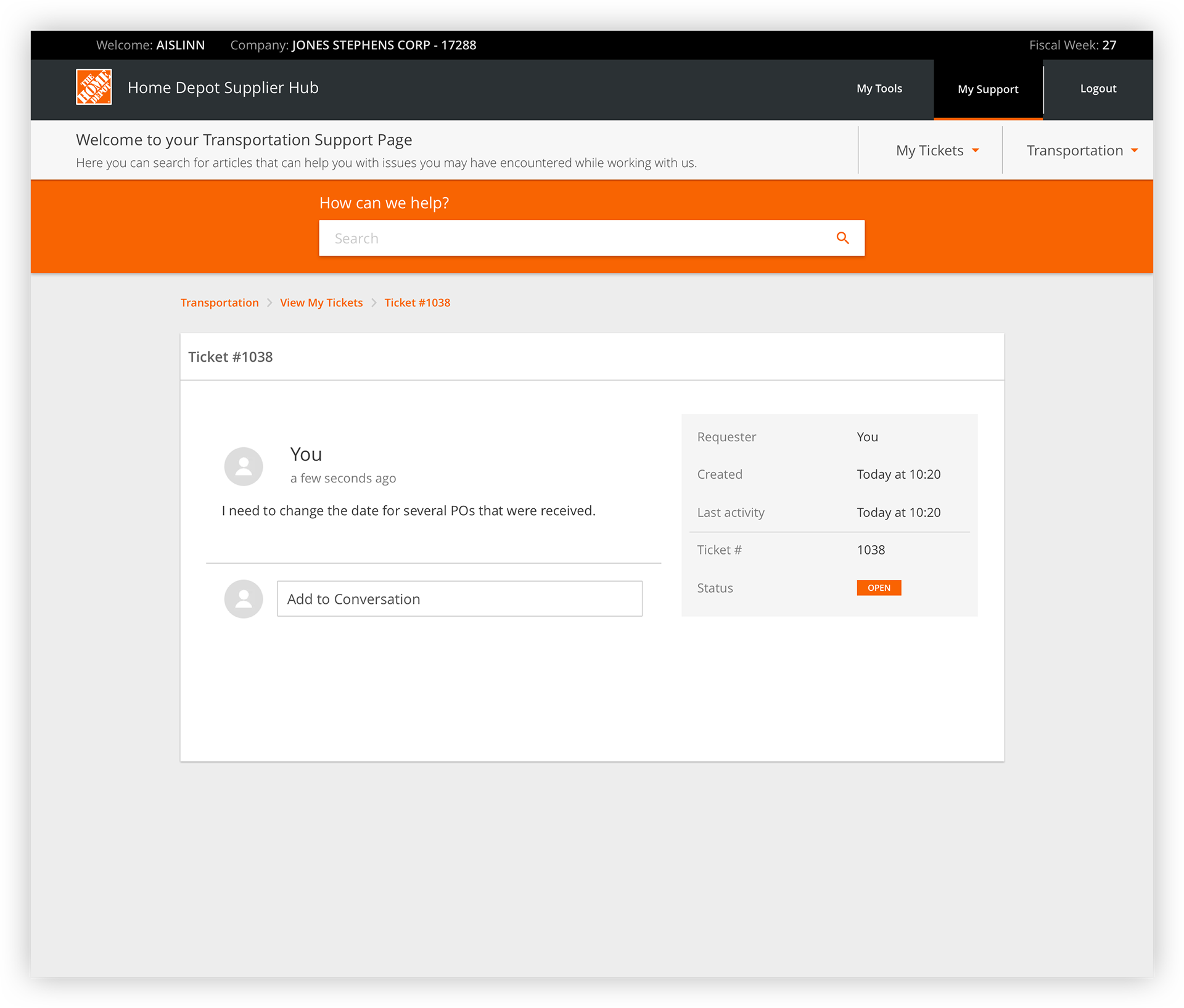
Ticket Information Page
Each ticket on the "My Tickets" page hyperlinks to that ticket's information. On this page, the user can view when the ticket was submitted, the last activity taken on the ticket and what the current status is. The user can additionally see the initial description of the issue as well as add comments to the conversation. When the agent has worked on the ticket, the user will be able to see that action as well as the agent's comments in the conversation section on the left.
Future steps for this product would include testing this prototype and conducting more research on why suppliers felt they needed the Trending Discussions bucket.